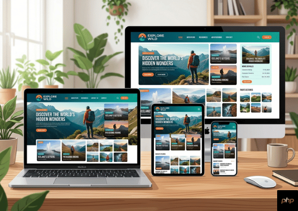
Responsive design is a key part of modern web development. Users access websites from many devices. Your site must look good on all of them.
Use flexible layouts instead of fixed widths. This allows content to adjust based on screen size. Media queries help apply styles for different devices.
Mobile-first design is a good approach. Start with small screens and then scale up. This ensures better performance.
Images should be flexible. Use CSS to make them resize properly. Avoid large images that slow mobile devices.
Navigation should be simple. Use menus that work well on touch screens. Keep buttons large enough to tap.
Test your site on real devices. Emulators help, but real testing gives better results.
Responsive design also helps SEO. Search engines rank mobile-friendly sites higher.
Performance matters too. Reduce heavy scripts for mobile users.
Keep layouts clean and easy to read. Avoid clutter.
A responsive website improves user trust and keeps visitors engaged.
Conclusion
Design for all devices. It improves reach and user experience.